Life@X
Duration
Type
Role
A mobile application for a virtual silicon valley experience. Connect essential tools, collaborate seamlessly and stay informed on events.
PROJECT 02
1 year
Team project
Product Design, UX
Product Design | UX
Developing a mobile application for the product Zelio, designed to streamline onboarding, enhance visibility, and achieve flexibility in a remote setting.
This application is an integrated module of Zelio, connecting essential tools, enabling seamless collaboration, and keeping users informed about key events. Experience a connected workplace where collaboration thrives.
Life@X

Business Goals
Enhance the efficiency, effectiveness, and candidate experience of the hiring process to reduce time-to-hire and improve the quality of new hires over the next 12 months.
Reduce the candidate drop-off rate during the hiring process by 25% within the next 12 months.
Goals

Product Goals
Enable clear and efficient communication between job seekers and employers.
Prioritize integration to ensure one stop solution for recruiters.
Build a community around the app for networking and support.

Research
Competitive Analysis:
To enhance our understanding of how employees interact within the internal application of an organization in different contexts, we conducted an in-depth analysis of various employee management applications such as zoho, HROne etc.
Data Analytics:
We collaborated closely with the HR team to gain valuable insights into the essential steps and data necessary for smooth operational execution. Key questions included identifying challenges in recruitment processes and understanding the frequency with which employees seek financial information from HR.
Design System:
During the sketching phase for design solutions, we opted to utilize the existing Design System Prime React. This decision was driven by the aim to expedite development and launch our MVP promptly, allowing us to gather valuable insights from our target users and enhance the overall product value iteratively.
Understanding Target Users:
Defining our target audience guided us in understanding the importance of having comprehensive information and features in our solution. User interviews were also conducted to gather insights directly from our target users.
Design Process
Storyboard:
To ensure clarity in our process, we utilized Notion to document the workflow, referring to it as our "empathy exercise." This exercise aimed to understand the user’s intent, thoughts, and obstacles.
After documenting the workflow, we validated the steps with the user group to ensure accuracy. Team members then suggested solutions by commenting on the steps in Notion. These solutions were refined through discussions and iterations.
Finally, we conducted a final validation with the user group to confirm that the refined steps and solutions effectively addressed the identified needs and obstacles.


Wireframes:
For wireframing we chose to use the existing design system for quick and effective review with the stake holders and SMEs.
User Interviews:
Defining who we're building for helped us grasp the need to have most of the information and features in place. We gained insights from the User group about how they have to switch between different applications and tools to perform their task. We learned that they faced problems in handling high volume of applications.
Design Repository:
To ensure visibility and effectively track all micro journeys, a repository was maintained on Notion and shared across the teams working on the product.
Although the team operated within a scrum framework, this approach facilitated the identification of all journeys, monitored the design status, and supported the design team with knowledge transfers and handovers.

User Testing:
We conducted comprehensive remote usability testing to ensure that the tool is user-friendly and meets our usability standards. This testing included both qualitative, focusing on user feedback and behavior insights, and quantitative methodologies, involving data-driven metrics and performance analysis. This approach allowed us to gather a thorough understanding of how users interact with the tool, identify any usability issues, and make informed improvements to enhance the overall user experience.
Iterating & Validating Assumptions
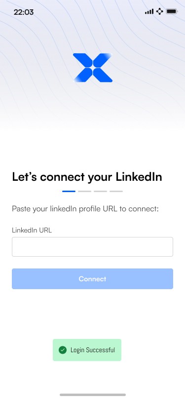
After loops of feedback and weekly design critiques from the Product Design team and the Engineering team, we learned that it would be efficient to integrate LinkedIn, to fetch the details rather than asking the user to populate the details and Zapier for connecting and automation.
We also collaborated closely with the Copy team to shape and improve the product experience. The content team contributed significantly by creating clear, welcoming content that helps users understand the procedure and have a pleasurable onboarding experience.
We continued to closely collaborate with teams to get input. Validating our design solutions through user testing was extremely helpful in building confidence in our design selections.
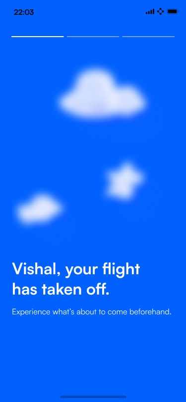
High Fidelity Design





Conclusion and Challenges
The initial challenge was ensuring the product met real market needs and provided unique value compared to competitors.
The plan was to utilize the organization’s Design System; however, several obstacles emerged due to the necessity of creating custom components for the React Native environment within a short timeframe. Following multiple discussions with the engineering team, we decided to adopt an existing React Native-compatible Design System and build upon it.
THANK YOU